
The First Few Seconds Matter
You can spend weeks building a website and still lose someone almost immediately after they arrive. That doesn’t necessarily mean the design is bad. It may simply mean the visitor couldn’t figure out what they were looking at, whether they were in the right place, or what they were supposed to do next.
People don’t arrive at a business website with unlimited patience. They usually have a question, a problem, or a reason for being there. If the website makes them work too hard to find the answer, they’ll move on. And they don’t need to announce that they’re leaving. They just close the tab and go somewhere else.
That’s why the first few seconds aren’t really about impressing someone. They’re about orientation. The visitor should have a reasonably quick understanding of who you are, what you do, who you serve and why they should keep looking.
The Website Doesn’t Explain What the Business Does
This is probably the biggest problem I see. A homepage opens with a beautiful photograph, an oversized headline and some clever brand language, but the visitor still doesn’t know what the company actually does.
There is nothing wrong with creativity. A strong brand should have a personality. But the personality can’t replace the explanation. If I have to read three sections of your homepage before I understand what you sell, there’s a good chance I’m not going to read three sections.
The best Denver web design isn’t necessarily the website with the most impressive visual effects. It’s the one that makes the business clear while still giving the brand room to look and feel like itself.
The Visitor Came for Something Specific
Another reason people leave quickly is that the page they land on doesn’t match what they were looking for. Someone searches for a specific service and lands on a generic homepage. Someone clicks an advertisement promising one thing and arrives at a page talking about something else. Someone reads an article about a particular problem and can’t find any obvious connection to the company’s service.
That’s a relevance problem, not necessarily a design problem. Every page should have a reason for existing. A service page should explain the service. An article should answer the question that brought someone there and provide a logical next step. If the website makes visitors start over from the homepage every time, you’re creating unnecessary friction.
Too Much Information Can Be a Problem Too
It is possible to go too far in the other direction. A business realizes that visitors need information, so it puts everything on the homepage: ten services, three dozen testimonials, a company history, five calls to action, a giant FAQ and every award the company has ever received. By the time someone reaches the bottom, they have learned a lot without necessarily knowing what to do next.
Good web design isn’t about hiding information. It’s about organizing it. Important information should be easy to find, while supporting information can live deeper in the site where someone who wants it can get to it. A clear hierarchy makes the website easier to use and gives search engines a much better understanding of how the pieces fit together.
Slow Websites Lose People Before the Content Gets a Chance
Sometimes the visitor isn’t leaving because of the message at all. They’re leaving because the page hasn’t finished loading. Large images, unnecessary scripts, excessive plugins, animation, third-party services and poorly optimized themes can all add weight to a website. On a fast desktop connection, you may barely notice. On a phone using a less-than-perfect connection, the experience can be very different.
I’m not interested in chasing a perfect speed-test score simply because a testing tool produces a number. What matters is whether the website feels responsive to an actual visitor. If someone is staring at a blank section while the page tries to load an oversized image or unnecessary script, you may have lost the visitor before they ever saw your best content.
Performance is also part of the broader relationship between website design and SEO. A website needs to work for people first, but the technical choices made during development can affect how the site is experienced and understood by search engines too.
Mobile Changes the Entire Experience
There is a big difference between making a desktop website shrink down to fit a phone and actually designing an experience that works well on a phone. Navigation changes. Text needs to remain readable. Buttons need to be usable. Forms need to be manageable. Images need to work within a much smaller screen.
Mobile visitors are also often doing something very specific. They may be standing in a parking lot looking for a phone number, sitting at home comparing service providers, or searching for a business while they’re already close to making a decision. If the mobile version makes basic information difficult to find, the visitor doesn’t owe you the patience required to figure it out.
People Look for Trust Signals Quickly
Visitors also make rapid judgments about whether a business feels legitimate. An outdated address, broken link, generic stock photography, inconsistent branding or a website that looks like it hasn’t been touched in five years can create doubt almost immediately.
The reverse is true as well. Specific service information, real project examples, recognizable credentials, useful reviews, clear contact information and professional photography give people evidence that there is a real business behind the website. You don’t need to cover the screen with testimonials saying how wonderful you are. Trust works better when the website provides enough evidence for the visitor to make that judgment on their own.
Popups and Distractions Can Get in the Way
There are times when a popup makes sense. There are also websites where you can’t read the first paragraph without being asked for your email address, accepting cookies, starting a chat, watching a video or signing up for something.
Every additional interruption competes with the reason the visitor came to the site in the first place. That doesn’t mean every popup is bad or that every website needs to be completely minimalist. It means the interruption should have a purpose and should not prevent someone from getting the information they came for.
The same principle applies to animation. Movement can be useful when it directs attention or communicates something. Movement simply because a designer had access to an animation tool is another matter.
Navigation Should Feel Obvious
Good navigation is almost invisible. You don’t think about it because it makes sense. You know where to click for services, where to find information about the company, how to contact the business and where to go if you want more detail.
Bad navigation makes visitors stop and think. Important pages are hidden under vague menu labels. Services are grouped together when they should be separate. The contact button is difficult to find. Or the site has so many menu options that the visitor doesn’t know where to begin.
This is one of those areas where a website can benefit from being simpler rather than more sophisticated. Visitors shouldn’t have to learn your organizational system before they can use the website.
The Call to Action Is Missing or Too Aggressive
Some websites don’t tell visitors what to do next. Others tell them too aggressively. Every section seems to have a giant “GET STARTED NOW” button, and the entire site feels like it is trying to close the sale before the visitor has even figured out whether the company is relevant.
There is a middle ground. A call to action should make the next step easy without pretending that every visitor is ready to buy immediately. Depending on the business, that might mean calling, requesting a quote, scheduling a consultation, viewing a portfolio, reading another article or simply learning more about a service.
A good website recognizes that visitors can be at different stages of the decision process. The important thing is giving them somewhere useful to go next.
A Beautiful Website Can Still Have a Bad User Experience
This is worth emphasizing because design reviews tend to focus heavily on appearance. A website can look fantastic in a presentation and still be frustrating when someone actually uses it. The navigation may be awkward. The text may be difficult to read. Important information may be buried. The mobile version may feel cramped. The animations may slow everything down.
That doesn’t mean visual design isn’t important. It means visual design is only one part of the experience. The real test is what happens when a person arrives with a question and tries to find the answer.
That’s also why I wouldn’t evaluate a website simply by asking whether it “looks expensive.” The better question is whether the design supports the business. I’ve written about that distinction in Affordable Web Design in Denver: What You Really Get.
The Fix Usually Starts With Clarity
If visitors are leaving quickly, the answer isn’t automatically a redesign. Start by looking at what someone sees and experiences. Is the business immediately understandable? Does the page match the search or link that brought the visitor there? Can someone find the important information without hunting for it? Does the site work properly on a phone? Is anything unnecessarily slowing or interrupting the experience?
Then look at what happens after those first few seconds. If the visitor stays, can they understand the service? Can they find evidence that the business is credible? Can they move naturally to another useful page? Is there a reasonable next step?
Those questions are much more useful than simply asking whether the homepage needs a new color scheme.
People Don’t Leave Websites for Just One Reason
There isn’t a single formula that determines whether someone stays on a website. Sometimes they leave because the site is slow. Sometimes they realize the business doesn’t offer what they need. Sometimes the information is too vague. Sometimes the design feels untrustworthy. Sometimes they simply found the answer they wanted and left.
That’s why bounce rate or time on page shouldn’t be treated as a verdict on the website by themselves. You have to understand what the visitor was trying to accomplish and whether the page helped them accomplish it.
A Website Has to Work as a Whole
This is where I think a lot of website discussions go off track. We separate everything into little boxes: web design over here, SEO over there, content somewhere else, branding somewhere else, conversion somewhere else. The visitor doesn’t experience any of those boxes separately. They experience one website.
The message has to be clear. The design has to support the message. The navigation has to make the information easy to find. The content has to answer real questions. The technical foundation has to work. Search has to be able to understand the site. And once someone arrives, the website has to give that person a logical reason to continue.
That’s the approach we take at Big Orange Planet. We don’t think of a website as a pretty brochure that gets launched and forgotten. We look at the website as part of the business’s larger system for being discovered, understood, trusted and ultimately contacted.
Sometimes that means a completely new website. Sometimes it means fixing the website that’s already there. Sometimes the biggest opportunity is better content, stronger SEO, clearer messaging or a simpler path to conversion. The point is to figure out what the business actually needs instead of automatically assuming the answer is another redesign.
If visitors are leaving quickly, that’s worth investigating. But don’t start by blaming the visitor. Look at the experience you’re giving them. A website that makes the business clear, useful, credible and easy to navigate has already solved one of the biggest problems a business website can have.
Big Orange Planet is a Denver web design and development company serving businesses throughout Colorado. We build websites around the businesses they represent—not just around what looks good on a screen.
This article was written by Ally Lennon, Big Orange Planet’s SEO legend—call him directly! Phone: 720-272-0770.
Related Reading
This article reflects the thinking behind how we approach websites, search and long-term digital strategy at Big Orange Planet. If you found it useful, you might also enjoy:
- Why You’re Getting Search Traffic But No Leads
- Can a Website Increase Sales? Here’s What Actually Makes The Difference
- What Makes A Website Feel Expensive?
- What Small Businesses Really Need From a Website
Over the coming months, The Big Orange Planet Journal will continue exploring search, branding, website architecture, local SEO, artificial intelligence and the ideas shaping how businesses are discovered — and trusted — online. If you’d like to follow along, you can sign up below for new articles and ideas as we publish them. If you’d like to discuss your website, SEO strategy or digital marketing goals, visit our Contact Us page or explore our Denver web design and SEO services.
Get the Good Stuff
No fluff. Just practical web design ideas, SEO insight, behind-the-scenes projects, & solutions we've tested in the real world.
Never Miss a Good Idea
More Big Orange Knowledge
October 13, 2025
Headless WordPress: When and How to Use It
Headless WordPress refers to a setup where WordPress is used solely as a…
June 12, 2026
Why Some Website Content Never Ranks
Google search results are shifting across industries, keyword clusters, and…
May 30, 2026
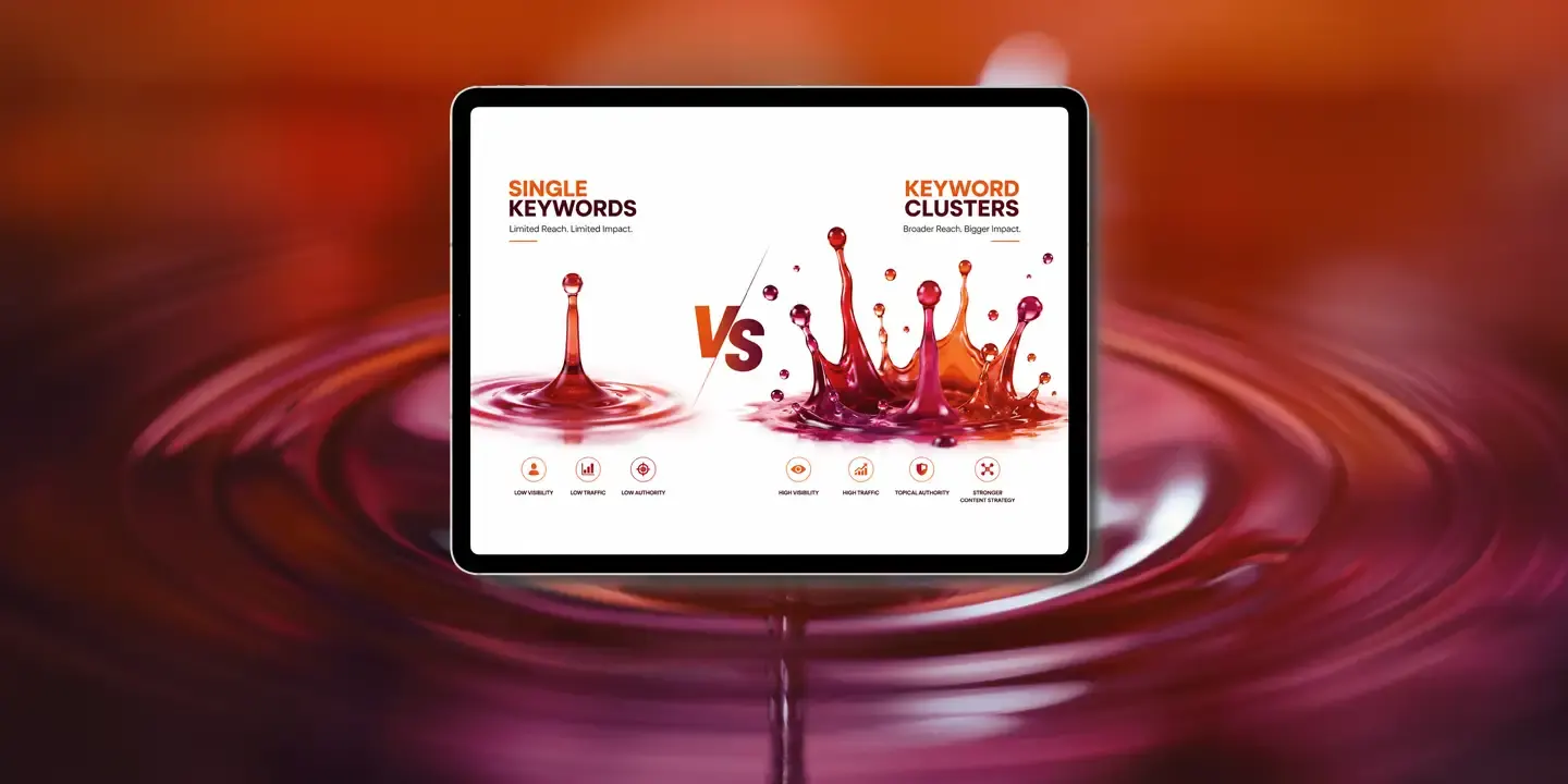
Keyword Clusters vs. Single Keywords in SEO: Why Topic Authority Wins
Keyword clusters build SEO authority around an entire topic rather than a…

September 22, 2026
How to Get Your Business Into AI Search Results
Learn how to make your business easier for Google, ChatGPT and other AI search…
May 20, 2026
Top 10 Branding Trends in 2026
Discover how AI is revolutionizing web design — from smart automation and…

March 27, 2026
Why Google Rankings Are Moving Daily (Not Monthly Anymore)
Google rankings can move from day to day without anything being wrong with your…