
Finishing Our IDX Broker Customization: Solving the Property Popup — Part 3
By Sarah Lennon – 4 minute read
In Part 1 of this series, I wrote about how we customized IDX Broker for REV Real Estate in Cody, Wyoming. We restyled the listings interface, search controls, property cards, map pins and other elements so that moving from the main REV website into its live MLS property search no longer felt like entering a completely different application. There was one element we deliberately left unfinished: the property popup that appears when someone selects a listing on the map.
The default popup worked, but listings containing more information exposed a layout problem. The image floated on the left with the property information beside it. When that information became too long for the available space, it wrapped underneath the image. Functional, but not particularly polished. The obvious solution seemed to be a better two-column layout. It turned out to be considerably more complicated than that.
When Custom CSS Starts Fighting the IDX
Our first approach was to redesign the popup across desktop, tablet and mobile. We increased its width, changed the image dimensions and reorganized the information so the image would remain on the left and the property details on the right. It didn’t work particularly well at any size. Trying to impose one customized approach across all three responsive layouts meant that changes intended to fix one screen size caused problems elsewhere. Even on desktop, where we had the most space to work with, the map ended up visibly out of position.
The reason is important when customizing any third-party IDX system. You’re not designing an ordinary web page from scratch. The listings, map, markers and popups are being generated and controlled by another application, with its own HTML, JavaScript and responsive behavior. Change one part too aggressively and you can interfere with another part of the system. In our case, changing the popup dimensions affected the way it behaved within the map. Trying to compensate for that across multiple breakpoints quickly became a collection of fixes creating other fixes. Rather than keep adding CSS to a solution that clearly wasn’t working, we removed the experimental styling and contacted IDX Broker.
IDX Broker Gave Us the Missing Piece
We explained exactly what we were trying to achieve: keep the property image on the left, keep all of the listing information on the right, and prevent longer listings from wrapping underneath the image without disrupting the map. IDX Broker support suggested using a CSS media query so that our custom popup styling only applied at specific screen widths:
@media screen and (min-width: 1024px) {
/* Add desktop popup styling here */
}
They also suggested using max-width rules if we wanted to make separate adjustments for tablet or mobile. That was the heart of the solution. We didn’t need to force one custom design across every device. IDX Broker already had responsive behavior for smaller screens. Instead of replacing that system, we could concentrate our customization where it produced the biggest improvement and leave the existing responsive behavior alone everywhere else
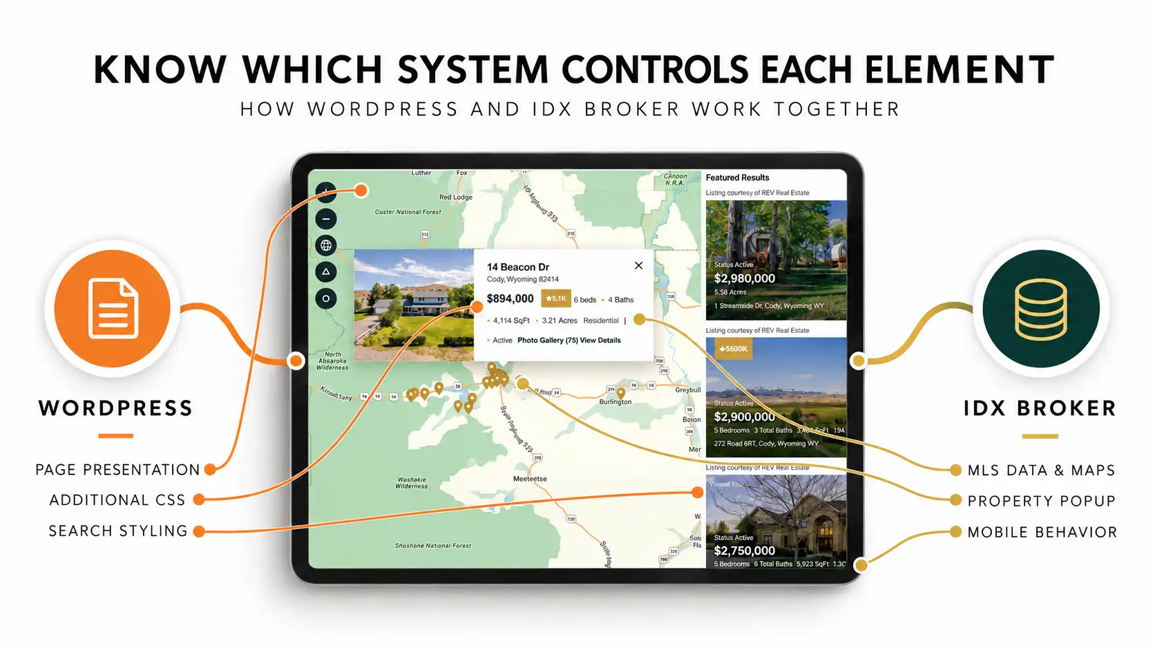
A Custom REV Popup on Desktop
We started again, this time building the custom popup specifically for screens 1024px and wider. The property image is now locked into the left side of the popup and all listing information stays within a dedicated column on the right. Longer property information can no longer wrap underneath the image, and because the CSS only operates above our chosen breakpoint, we aren’t simultaneously trying to compensate for what happens on smaller screens. Once that structure was stable, we styled the details to match REV. The address and price use REV’s deep green, with gold accents for separators, map pins and price-reduction badges. We refined the typography, spacing, links and close control and cleaned up some awkward separators generated by the original IDX output. Beds, baths, square footage, acreage, property type and status now form a much clearer hierarchy, while Photo Gallery and View Details remain immediately accessible.
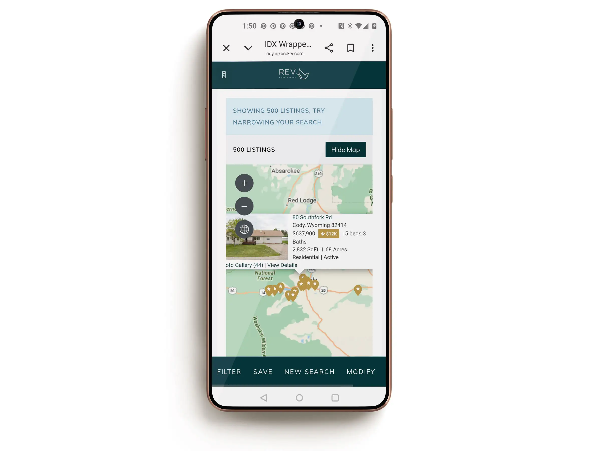
On Smaller Screens, IDX Takes Over
Below 1024px, our custom popup styling simply stops. We could have continued by creating separate CSS for tablets and phones, as IDX Broker suggested. We decided not to. Tablet represents a relatively small part of the audience, and when we tested the original IDX popup on a phone, it worked perfectly well. It still uses the simpler default presentation, but on the smaller screen that is far less noticeable than it was on desktop. More importantly, we’d already learned what could happen when we tried to control the popup across every responsive layout. We wanted a clean, reliable final solution rather than another round of breakpoint-specific experimentation for very little practical gain. So desktop gets the fully redesigned REV popup. On tablet and mobile, IDX Broker continues to handle its own responsive behavior.
This is also an important distinction when talking about the limitations of IDX systems. IDX Broker isn’t the only platform of this kind, and different IDX products handle their interfaces differently. The broader challenge is that when you customize a third-party property-search system, you are working with an application that already controls significant parts of its markup, mapping and responsive behavior. You can push that design a long way. But good customization isn’t necessarily about overriding everything. It’s about knowing what you should control and what the underlying platform should continue to control.
The Finished REV Property Search
With the popup complete, we’re calling the REV IDX customization finished. On desktop, virtually every visible part of the property-search experience now carries REV’s design: green and gold search controls, square buttons, custom gold map pins, price-reduction badges, favourite states, property cards and finally the map popup itself. Underneath it all, IDX Broker is still doing what it is supposed to do: providing the MLS data, search functionality, maps and responsive infrastructure. We haven’t tried to rebuild that system. We’ve changed its presentation where doing so improves the experience and left its native behavior intact where it works better. The final solution wasn’t more CSS everywhere. It was knowing exactly where our CSS should stop. And with that, our IDX Broker trilogy is done.
If you’re interested in the thinking behind this project, read the other articles in our IDX Broker series:
- How We Gave an IDX Broker Listings Page a Fully Custom Look — Part 1: customizing the REV property search and bringing IDX Broker into the website’s visual system.
- How We Turned IDX Broker Property Searches Into Leads — Part 2: how we connected the IDX property search to REV’s lead-generation process.

About Sarah Lennon
Sarah Lennon is co-owner and lead designer at Big Orange Planet, a Denver web design and SEO company. For more than 20 years, she has worked across web design, interactive experiences and digital strategy, exploring how design and functionality work together — from ecommerce and property search systems to interactive tools, animation and immersive brand experiences. She now works daily with AI as part of the real-world creative and development process. She writes from that hands-on experience, exploring where AI genuinely improves creative and technical work, where it falls short, and what happens when you actually put these tools to work on live projects.
Get the Good Stuff
No fluff. Just practical web design ideas, SEO insight, behind-the-scenes projects, & solutions we've tested in the real world.
Never Miss a Good Idea
More Big Orange Knowledge

Colorado Web Design & Development: Strategy, Costs & Growth Guide
Colorado web design is about more than choosing a template. This guide looks at…
Do I Need SEO Before, During, or After My Website Is Built?
SEO isn’t something you simply add to a website after it has been built. The…
What Makes A Website Feel Expensive?
Some websites instantly feel polished, credible and expensive while others…
Create a Lightbox in WordPress
A lightbox is a dark pop up window that overlays your web site to showcase an…
How to Successfully Compress Images for the Web
Any visual web content has weight. And the larger a file's size, the slower it…
Google Business Profile Optimization for Denver Companies
A strong Google Business Profile can make a major difference in local search.…