A clean HTML email template can fail in seconds. One inbox strips CSS, another adds odd spacing, and the call-to-action drops below the fold. That’s the trap: email is not a browser, so “simple” takes real discipline. Want proof? Litmus-based tracking shows more than one-third of opens happen on an Apple iPhone, so a desktop-perfect layout can still lose the majority of attention. Mailjet’s 2024 engagement report puts mobile checking even higher: 71.5% of consumers say they most often check email on a phone. And Gmail can’t be ignored; a Sinch Mailgun survey found 72.1% of participants have a Gmail account. This article maps the design mistakes that make an HTML email template look broken, feel hard to read, or miss clicks before anyone even scrolls.
Foundation Mistakes That Break Layout Fast
- Mistake 1. Designing for one email client. An HTML email template that looks perfect in Apple Mail can shift in Gmail or collapse in Outlook, so testing must cover more than one inbox.
- Mistake 2. Relying on modern CSS for the core layout. Word-based Outlook ignores many styles on divs; tables and simple inline CSS keep the structure steady. When flex fails, columns stack in strange places fast.
- Mistake 3. Using a full-width layout with no max width. A 100% layout can feel sloppy on large screens; a fixed container around 600px keeps reading smooth while still scaling on mobile.
Visual and Content Mistakes That Hurt Clicks and Trust
When a button is small, thumbs miss it. Apple’s guidance uses a 44×44 pt hit area as a floor, and that sizing rule keeps an HTML email template tappable on phones. Low contrast is the next killer – WCAG. Calls for at least a 4.5:1 contrast ratio for normal text, so pale gray copy on white is not clean, and it’s hard to read. Image-first designs create a bigger risk than many teams expect. Many reputable sources have reported image blocking affecting 43% of emails in their Gmail-era analysis, so the offer must still make sense when images don’t load. Then comes styling overload – three fonts, mixed button shapes, and random link colors – making the message feel messy or sketchy. A tighter type and color set keeps the HTML email template clear and easier to trust.
The Checklist Section: Catch These Before You Hit Send
A fast QA pass saves hours of “why did this break?” later, especially when the same HTML email template must behave on phone and desktop.
- Disable images and confirm the HTML email template still makes sense: offer, proof, and CTA appear as text, not only in a hero image.
- Check tap size on mobile. Apple recommends a 44×44 pt minimum target, so buttons and linked rows should meet that and have breathing room.
- Review dark mode. Scan logos, icons, and thin dividers; auto-invert can turn light gray text into low-contrast mush.
- Preview the layout from the recipient’s perspective. The headline, one key benefit, and the main button should be visible without unnecessary searching.
Testing and Delivery Mistakes That Cause Silent Failure
A design preview is important for a test. An HTML email template can look perfect in a builder, then shift in inboxes when Gmail trims margins or Outlook drops a simple style. That’s why inbox checks matter, not screenshots. Pre header text is another common miss. If leave it blank, many inboxes pull the first stray line they can find, often a view in browser link, which hurts opens. Size can quietly wreck results, too. Gmail can clip messages when the HTML passes 102 KB, hiding the lower part behind a view entire message link. Sometimes the footer unsubscribe or tracking pixels. Even when code stays lean, heavy images slow load and push the CTA down. It’s important to consider delivery rules now that punish sloppy sending at scale. Google’s bulk-sender rules apply at 5,000+ messages per day and focus on authentication, spam rates, and unsubscribe.
Build it to survive the inbox
A good HTML email template doesn’t always have a unique design. It must display consistently across Gmail, Outlook, and Apple Mail, with clear spacing, well-written copy, and high-quality, clickable buttons. Consistency and quality are more important than appearance. Even small decisions matter. It’s important to remember that Gmail truncates messages larger than 102 KB, so long messages can be hidden behind the “view full message” button. The safest way is simple: maintain a basic layout, write well-written copy that works without images, and test in real mailboxes before each send.
More Big Orange Knowledge
June 28, 2024
The Importance of website speed
Denver Web DesignWeb DesignSEO
How fast your website loads is a critical piece of the SEO puzzle. And…
January 15, 2025
Google My Business- Advanced Optimization Techniques
Denver Web DesignBrandingWeb DesignSEOEcommerceSecurity
Establishing strong credibility with Google My Business will earn you higher…
February 27, 2026
5 Key Strategies to Boost PR Team Productivity and Efficiency
BusinessDigital MarketingPublic Relations
Boost PR team productivity with 5 practical strategies: collaboration tools,…
February 25, 2026
The Technical SEO Essentials for Every Website
web developmentSEODigital Marketing
Great content won’t rank if your site’s technical foundation is broken. Here…
March 8, 2026
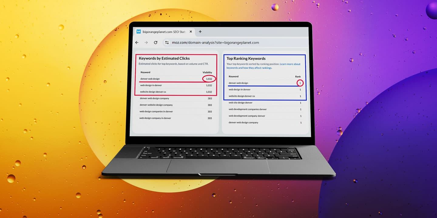
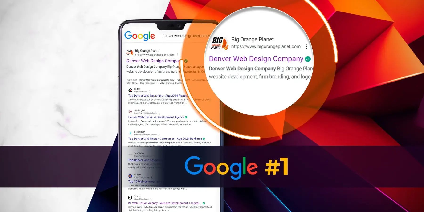
We Ranked #1 on Google for Competitive Keywords — Here’s How
We reached #1 on Google for a cluster of Denver web design and development…
August 28, 2024
Google – Algorithm update August 2024
Organic SEODenver Web DesignAIWeb DesignLocal SEOSEO
Google is continuing to roll out a very major update to its algorithmn, what is…


